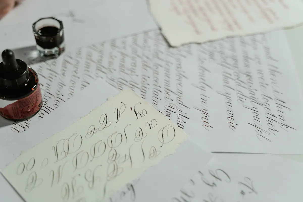
Nobody picks up a dip pen and writes a neat copperplate line on the first attempt. The strokes wobble, the ink blots, the words bunch up in the middle, and it is tempting to decide that your hands simply are not built for this. They are. Nearly every problem a beginner runs into is mechanical rather than mysterious: a grip that is too tight, a nib fighting the paper at the wrong angle, spacing decided by guesswork, or a practice habit that repeats the same mistake forty times over. Fix the mechanics and the letters improve far faster than you would expect.
Shaking is usually blamed on nerves, but the cause is often structural. Beginners grip the holder as though it might escape and then draw lines from the fingers, which gives you a stroke the length of your knuckle and all the tremble that comes with it. Fine motor movement is not what calligraphy needs. Draw the stroke from the forearm and shoulder, letting the hand glide along the paper, with the fingers doing nothing more than holding the pen steady.
Speed matters too. Very slow strokes wobble more than confident ones, because every hesitation registers in the line. Aim for an even, medium-paced stroke with no pause in the middle. Before you write a single letter, spend two or three minutes on drills:
If your pencil lines wobble as much as your ink lines, the pen is not the problem. Check your posture: sit square to the desk, keep the wrist and forearm off the table edge if you can, and keep breathing.
Broad-edge nibs are usually held at roughly 30 to 45 degrees to the baseline, with italic sitting at the steeper end of that range. Hold the nib too flat and the thin strokes thicken and the letterforms collapse; hold it too upright and every downstroke turns into a scratchy sliver. Pointed nibs work differently: the slit should point along the slant line so both tines open evenly as you press.
Few people can judge an angle by eye for an entire page. Mark the holder with a small strip of tape, or draw a faint angle guide in the corner of your paper, and glance at it every few lines. If your hand aches after ten minutes, you are gripping too hard. Hold the holder further up than you would a pencil, keep the thumb and index finger relaxed, and let the nib rest on the paper rather than pressing into it.
Squashed words are one of the most recognisable beginner habits. The usual fix is to imagine an invisible letter in every gap: a narrow i or l between letters in most broad-edge hands, and a full o or n between words. Write a word with deliberately generous spacing first, then aim for the midpoint between too tight and too loose. Exaggeration teaches the eye faster than trying to correct a small error.
Rhythm is the other half of the problem. Letters get progressively wider and looser as you move across the page because your hand speeds up. Try counting a steady beat as you write, or tap a foot. For pointed-pen scripts, look at the white space between the downstrokes rather than the letters themselves; those gaps should read as an evenly spaced fence.
A page of beautiful letters can still look untidy if the lines rise and fall. Rule proper guidelines before you start: baseline, x-height, ascender and cap line, plus slant lines at the angle the script calls for. Copperplate-style scripts are commonly written on a slant of around 55 degrees from the horizontal, so it is worth ruling the slant lines rather than trusting your wrist.
Keep the paper at the same rotation for the whole session. If you find yourself turning the hand to reach the right-hand side of the page, move your arm and the paper instead.
When a line looks wrong but you cannot say why, hold the page up to a window, or turn it upside down. Misalignment is much easier to spot when the text stops being readable.
Blobs come from too much ink on the nib, a nib held too long in one spot before the stroke begins, or an ink that is too thin for the paper. Wipe the nib against the rim of the pot, dip less often, and get into the habit of starting the stroke the moment the nib touches down. Skips have a different cause: new nibs arrive with a thin film of oil from the factory, and no amount of ink will sit on them until it is gone. Scrub gently with a soft brush and a drop of washing-up liquid, rinse, dry, and try again.
Paper is the third variable. Rough cartridge paper shreds fine nibs and feathers ink; smooth, well-sized paper holds a crisp edge. Test any new pad in the corner before committing a whole page to it. Left-handed writers should also consider an oblique holder or a rotated paper position, with guidelines ruled on the right-hand side, so the hand does not drag through wet ink.
Writing the alphabet from top to bottom every evening feels productive but teaches very little if you never look at the model beside it. Slow down and study one letter a week. Write it large, trace over the exemplar, then write it freehand underneath and mark where it differs: is the bowl too round, the ascender too short, the weight on the wrong side of the stroke?
Proportion is where most beginners lose accuracy. See each letter as a skeleton before you think about decoration: an x-height of a consistent number of nib widths, ascenders and descenders of matching length, counters shaped like the ovals you practised at the start. Flourishes and swashes can wait until the bones are right.
Fifteen to twenty focused minutes beat a three-hour Sunday session. Try this, five days a week:
Date every practice sheet and keep them in a folder. Improvement in calligraphy is gradual enough that you will not notice it day to day, but a month of dated pages makes it obvious. Be patient with the wobbly stage; it passes, and it passes faster when you know what you are correcting.
Photo: MART PRODUCTION / Pexels
A practical, printable checklist for a journalling weekend away, covering notebooks, pens, ink, washi tape and the...
Grain direction decides whether paper folds cleanly or cracks, tears straight or ragged, and whether a bound book...
Hardcover and softcover journals compared on construction, durability, portability and writing comfort, with...

A journal for paper, ink, and craft.
