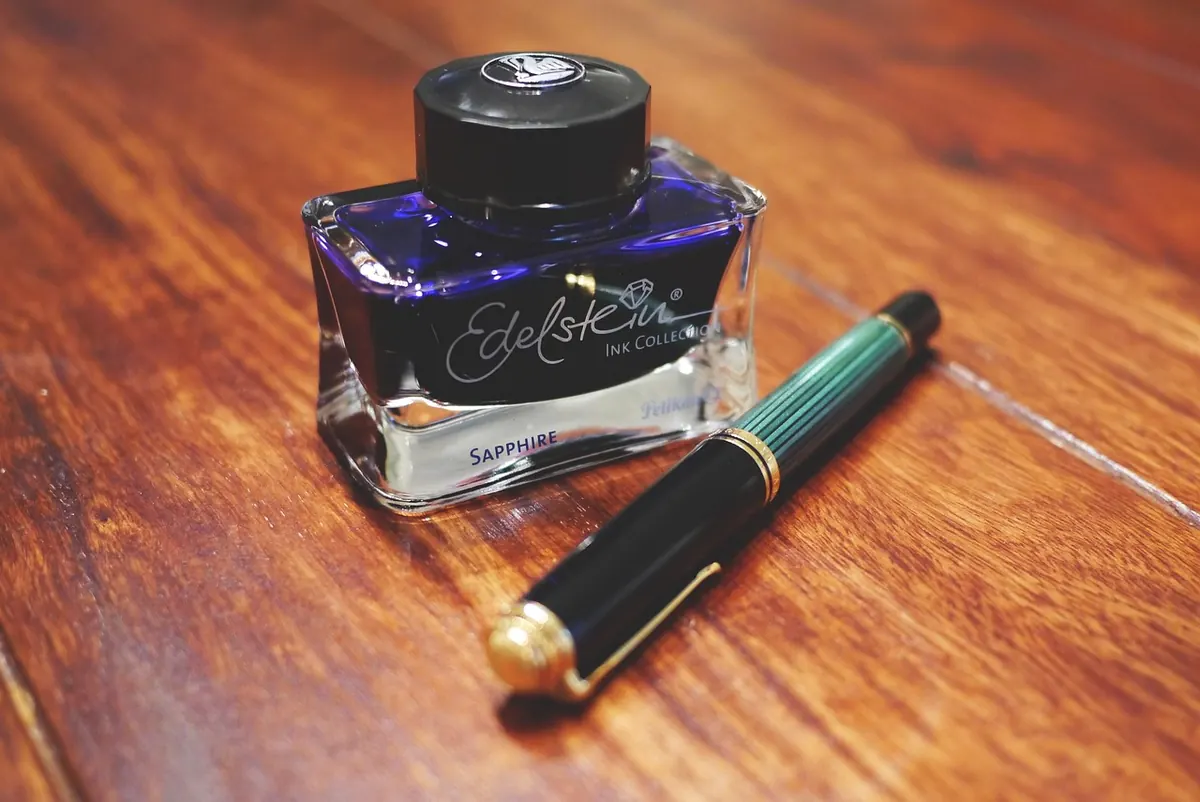
Two pens, one bottle of ink, two completely different results. That is ordinary life with fountain pens, and it is rarely the pen's fault. Ink is a small, carefully balanced mixture that has to travel down a narrow channel, sit on a sheet of paper, and dry at a speed that suits your hand. Change the paper, the nib or even the weather and the balance shifts. Four properties — saturation, shading, sheen and shimmer — plus drying time, explain most of what you see on the page.
Mostly water, for a start. Then colour, and a short list of additives: humectants to slow evaporation, surfactants to help the ink wet the feed and the paper, a biocide to stop anything growing in the bottle, and often a pH buffer to keep the whole thing stable.
Most fountain pen inks are dye-based — the colour is fully dissolved and soaks into the paper. Pigment inks carry tiny solid particles in suspension instead; they tend to sit closer to the surface, are usually more water-resistant, and ask for more careful flushing. Iron gall inks darken as they oxidise and are prized for permanence, with the usual caveat that they need sensible pen hygiene. Shimmer inks are simply dye inks with mica or similar particles stirred through them.
Saturation is colour strength: how much dye is in the bottle. A saturated ink looks dense and solid on the page. Wetness is a separate quality, describing how freely the ink flows out of the nib. Dense does not mean wet. Plenty of heavily saturated inks feel stingy in the pen, while some pale, watery-looking colours flood the page.
The two get mixed up because the results overlap. A wet ink lays down more liquid, so the line looks darker, spreads wider, feathers more on cheap paper and takes longer to dry. A dry ink gives a tighter, crisper line, behaves better on absorbent paper and dries quickly — which is why dry-writing pens are often the practical choice for everyday notes.
Shading is variation in tone within a single stroke. Where the ink pools — at the end of a stroke, along the edges, in the curve of an a — it looks darker. Where the nib leaves a thinner film, it looks lighter. The effect comes from the ink being partly translucent, so the colour of the paper shows through the thinner areas and deepens where the ink gathers.
Sheen appears when so much dye is laid down that it dries on the surface as a thin, reflective layer, usually along the edges of the strokes. It is a second colour rather than a highlight: blues commonly sheen red or pink, teals and dark greens can sheen red or purple, and some reds and purples sheen gold or green.
Getting it takes three things at once — a saturated ink, a wet nib and paper that does not drink. Coated paper such as Rhodia or Clairefontaine is the usual trick, because the ink stays wet on the surface and the dye has time to settle out. The trade-offs are real: sheening inks dry slowly, smudge easily under a warm hand, and can build up a crusty ring on the nib if the pen is left uncapped.
Shimmer ink contains fine particles that catch the light. They are heavier than the liquid around them, so they settle in the converter, the cartridge and the feed whenever the pen rests. That is why the first few words after a pause can be flat, and the last few in a fill sparkle beautifully.
Dry time is not a fixed property of an ink. It depends on the nib width, how wet the ink is, how much of it reaches the paper, and how absorbent that paper happens to be. Coated paper can multiply drying time several times over compared with a porous notebook. Humidity matters too: in a damp room, ink sits wet for noticeably longer.
The only reliable answer is to test it yourself, on the paper you actually use:
If you are left-handed, this test pays for itself. Fine, drier-writing nibs, quick-drying inks and smoother paper will do more for you than any change of grip, though resting a blotter sheet under your hand helps as well.
Behaviour changes with time as well as paper. An ink that feels well-behaved on day one can look darker and drier after a fortnight in the pen, because a little water evaporates through the nib. Note that in your swatch book too: write the ink on the day you fill, and again a week later.
Build up a handful of records like that and the guesswork disappears. You will know which ink suits a fine nib for quick notes, which one to reach for when you want shading on a smooth page, and which to keep for the letters where you can afford a slow dry. That is the whole point of understanding ink — not to chase the most dramatic effect, but to match the ink to the job in front of you.
Photo: LUM3N / Pixabay
A practical, printable checklist for a journalling weekend away, covering notebooks, pens, ink, washi tape and the...
Grain direction decides whether paper folds cleanly or cracks, tears straight or ragged, and whether a bound book...
Hardcover and softcover journals compared on construction, durability, portability and writing comfort, with...

A journal for paper, ink, and craft.
